You spent forty minutes designing a peony-and-ranunculus arrangement that would make a wedding photographer weep. Then you photographed it under the fluorescent ceiling fixture in your shop, with a red bucket and a cardboard box visible in the background, and uploaded it to Instagram.
This is the quiet problem in the floral industry. The arrangements are extraordinary. The photographs are not. And the gap between the two is costing real money — every week, in arrangements that don't sell, in posts that don't convert to orders, and in customers who decide to call the chain shop down the road because at least their website looks professional.
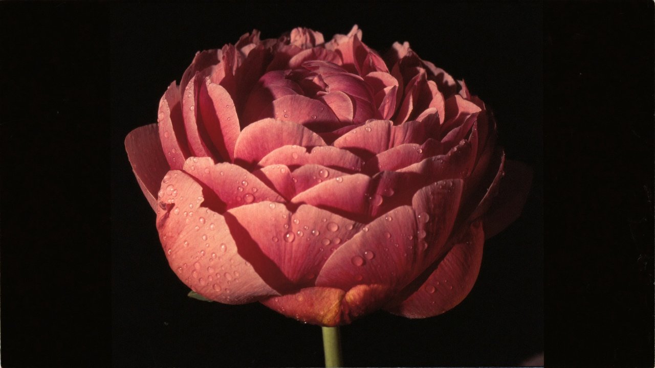
What Bad Light Does to Beautiful Flowers
Fluorescent shop lighting has a green-yellow color cast. It crushes the saturation in pinks, dulls reds into brown, and turns whites into a sickly cream. The arrangement in front of you, in person, looks completely different from the arrangement on your phone screen. A bride scrolling Instagram doesn't see your peony — she sees a yellow-green object in a confused frame.
This isn't a phone problem. It's a lighting problem that no phone is going to fix. Even an iPhone 16 Pro under shop fluorescents is going to deliver a color-shifted image, because the white balance algorithm has nothing accurate to lock onto.
The Three Specific Problems Killing Your Floral Sales
1. Background Clutter
The wedding planner you're hoping books a $4,000 ceremony arrangement is looking at your photo and seeing: bucket, cardboard, refrigerator handle, a sliver of someone's apron, and somewhere in the middle, an arrangement. The background is doing all the talking. And what it's saying is "small operation, distracted, not the place to spend serious money."
2. Flat or Wrong-Direction Lighting
Overhead shop lighting flattens the arrangement. Petals lose dimensional separation. The depth and texture that took skill to compose disappears in the photograph. Without directional light from one side, every flower in the arrangement looks like it's printed on the same flat plane.
3. Color That Doesn't Match Reality
The blush peony in your shop is a soft, dusty pink. The blush peony in your iPhone photo is salmon. The dusty rose dahlia is now an orange-coral. Customers who see the photo and walk into the shop are confused — and the ones who order without seeing the arrangement in person feel deceived when delivery arrives.
What the Fix Actually Looks Like
You have three real options.
Option one: build a small product photography setup in your shop. Two LED softboxes with daylight color temperature, a foam-board sweep for backgrounds, a tripod, and a calibrated phone or DSLR. You'll spend a Saturday learning to use it, three to five hundred dollars in equipment, and ten to fifteen minutes per arrangement to photograph it properly. This works if you have time. Most shops don't.
Option two: hire a product photographer. Excellent quality, but at $40 to $75 per arrangement and the scheduling overhead of getting a photographer in for new pieces every week, this is unsustainable for a working florist. It only makes sense for catalog photos that are going to sit on your website for a year.
Option three: shoot on your phone — but enhance the result. AI image enhancement can take your existing shop-lit phone photos and replace the background, correct the color shift back to true, add directional studio lighting, and deliver a result that reads as catalog quality. The arrangements never have to leave your shop. The photography happens in the moment of design. The post-processing happens at scale, in batches, for a few dollars per image.
What "Catalog Quality" Means for a Florist
Three specific transformations matter for floral product photography:
- Background replacement. Pure white or rich black, depending on whether the post is going to a feed grid or an editorial page. The bucket goes away. The apron goes away. The arrangement is the only thing in the frame.
- Color truth and vibrancy. The blush is blush again. The dahlia is dahlia again. The greens look like real greens. Saturated where saturation reads as luxury, restrained where restraint reads as elegance.
- Lighting direction. A simulated single-source softbox light from forty-five degrees, with the kind of fall-off and shadow geometry that gives the arrangement actual depth. Petals separate. Layers read. Composition you spent time on is finally visible.
Our floral case study walks through the before/after transformation on a North Jersey shop's catalog, including the impact on online order rate and average order value.
The Cost Math
If you're a working florist doing $300,000 to $1,000,000 a year, your Instagram and your website are doing more sales work than your shop window. A 47% lift in online order rate after upgrading photo quality — which is what we measured for one Bergen County client — is the kind of revenue change that pays for the photography enhancement many times over in the first month.
At our pricing, professional-quality enhancement of a typical floral product photo runs $12 per image, with batch discounts on catalog runs. Compared to $40 to $75 per arrangement for traditional photography — and the scheduling impossibility of doing it weekly — the math isn't close.
Where to Start
Send us one photo of your most recent arrangement. Whatever you shot, on whatever device, under whatever light. We'll return a free, watermarked enhanced version so you can see exactly what's possible before committing to anything. See our full floral service or request a free sample edit here.